
If you logged into Wufoo last week, you probably noticed some big changes to our interfaces for managing your forms and reports. Because the Managers in Wufoo are based on some of the oldest code in our application, we were excited about taking some time to give them an aesthetic refresh and enhance them with some really nice features targeted at our big boy power users.
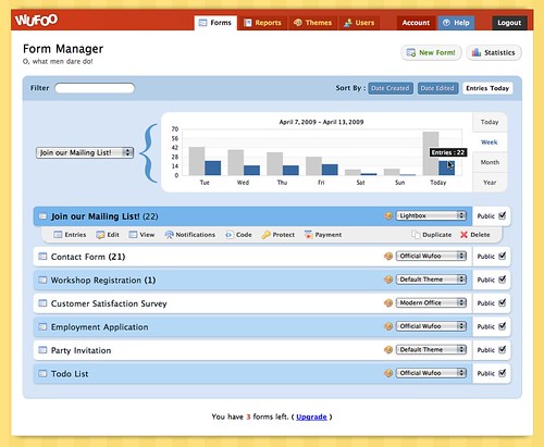
**New Form Manager**
**New Report Manager**
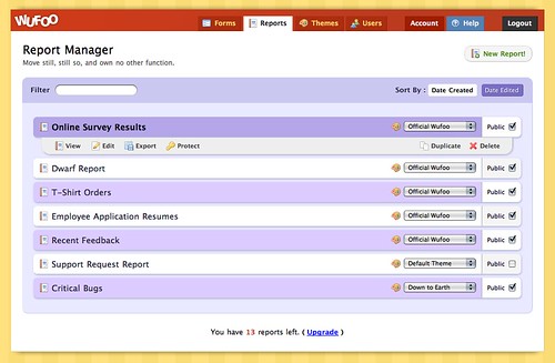
If you’re a user with a lot of forms and reports, you can wave goodbye to our old school managers, which were lacking in features for organization and minimizing clutter, and say hello to the new and improved managers that come equipped with the following sweet enhancements:
###Live Filtering
Gone are the days of scrolling and searching, my friends. With the new super-fast live filtering feature, you can now quickly filter your list of forms and reports as fast as you can type your keywords and searches. It’s pretty amazing to experience and probably best illustrated by a (http://www.flickr.com/photos/wufoo/3440298441/).

###Smarter Sorting
The old managers had only one way to display your forms and reports and that was by Creation Date from the oldest to the newest. This meant that when you duplicated or created a new form or report, you always had to play the scrolling dance to access the new creations at the bottom of the page. It was the opposite of good times.
The new managers now sort from **newest to oldest** by default, which makes finding that new creation much easier at the top of the page. And because flexibility is our new focus in the managers, you can also sort forms and reports by the date they were **last edited**, which is great for users that are only making changes to certain forms and reports in the middle of their stack. If you’re in the Form Manager specifically, we also added the ability to quickly access your most active forms by sorting that list by the **new entries collected today**. As you saw in the (http://www.flickr.com/photos/wufoo/3440298441) above, sorts can be changed even after doing some filtering, which means you can easily isolate and bubble up exactly what you want, when you want it.
###Built in Memory
The new managers were also designed to automatically remember your preferences and last actions. If you select a sort or implement a filter and then leave the page to change a form or view some data, they’ll remember the preferences the next time you return or login.
###More Compact Design
One issue we had with the old managers was that they were much more difficult to scan. Because the action buttons under each form and report name repeated over and over again, the visual clutter made for a lot of wasted real estate. Additionally, because the system was generating this markup over and over again, on accounts with a large number of forms and reports, this actually impacted the load times for those users.
To improve usability and performance, we decided to hide these action buttons unless your mouse is hovering over a specific form or report. With the extra space we were able to increase legibility with larger font sizes and display more forms and reports in a smaller vertical space.
We hope you like playing with these new upgrades. As always with these new interface refreshes and code upgrades, this is just the beginning for the managers. We have so many more features planned for these new beauties and you’ll be happy to know that these new updates make implementing them by us much easier down the road. Thanks and enjoy!
Comments
Do not like the new colors
Posted April 14th, 2009 by Desiree Newsome.Everyone needs a hug.
Posted April 14th, 2009 by Kevin Hale.Nice work. Again.
Posted April 14th, 2009 by Frank Rosendahl.Well done. Looking great. Now all we need is to be able to tag forms and reports so we can find them by, say, client.
Posted April 14th, 2009 by Galen.I don’t like the new colors either, a -1 for usability.
Posted April 14th, 2009 by shervin.wufoo = genius ninja coding organization. You’re saving the world one form at a time. Bless you.
Posted April 14th, 2009 by Srini.Great stuff as far as the filtering… thanks! I always had trouble quickly finding my Forms for editing or duplicating, sorting through about 100 of them. > Good Times 🙂
However in Google Chrome, the visuals that are supposed to make the Form “boxes” rounded in the Manager, are black instead of “background colour” … not looking nice > Bad Times 🙁
The same thing looks absolutely fine in FireFox.
Overall I would say it is a bit less easy on the eye, but more functional … so I’ll happily go for the updated version.
Posted April 14th, 2009 by Greg.Awesome job guys (and ladies). I love the new charts and the inclusion of Javascript. 😀
Posted April 14th, 2009 by Danny Foo.Can you please make it so that your UI experience is automatically applied to all the world’s web forms?
Posted April 14th, 2009 by Schoschie.Everyone needs a hug.
Posted April 14th, 2009 by Schoschie.Great job on the new update. It really makes things easier for managing a ton of forms at once.
Posted April 14th, 2009 by Jay Owen.Awesome update…but I have to agree about the colors. There’s a bit too much contrast between them. Maybe lighten the upper one a little…regardless, great feature, and we can live with whatever colors you choose 🙂
Posted April 14th, 2009 by Bryan Chalker.I 3rd the motion, I do not like the new colors. They are very bright and saturated for an application. It defeats the purpose of row coloring. As UI wizards, you know the power of color on the user experience. As a UI designer myself, I use a very simple rule of thumb for applications. What do I notice first: the content, or the UI design? If I notice the UI design, does it enhance or detract? I am afraid in this case it is a problem on both counts. The new colors and the javascript f/x are annoying, and I must use the (very nifty) filters to whittle the list down to something legible.
On balance, this is a minor issue. You still have one of the best designed, finest services out there, which I use all the time. It is a great example of how it should be done.
Posted April 14th, 2009 by Gaird.Excellent work. easy to many forms
Posted April 14th, 2009 by Domar.It really makes things easier. Great job.
Posted April 14th, 2009 by CCTV Wise.