By Johan Lieu

I usually share handy tips and tricks you should follow to help make your Wufoo forms better but today I decided to go in the opposite direction and share three things you really should NOT do when creating your Wufoo forms. These mistakes might seem like common sense to some of you but I still see these mistakes far too often in the wild.
Worst of all, these mistakes prevent your users and potential customers from filling out and completing your forms, and if they aren’t finishing your forms, you’re not getting the data you need. There are plenty more things you ought not to do when creating your forms, but we felt these three are the most egregious offenders. Our goal here at Team Wufoo is to empower you to make your forms as easy as possible for folks to fill out and complete.
With that, onward!
1. Put All Of Your Fields On One Really Long Page
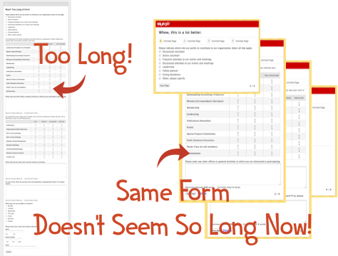
You’ve experienced it. You’re cruising along on a site, really moving at breakneck speed on whatever you’re working on, and the site needs you to enter in some information. You click through to the form and then you see it. The One Form To Rule Them All, And In The Darkness Bind Them. This form is massive. It just keeps going. And going. How many fields are there on this form? They, they can’t be serious, can they? Oh man, they are. Oh forget this, I’m outta here.

This is the absolute worst thing that could happen. Your users were totally into the site, jetting along, getting stuff done, but when they got to the form, they were like, “Thanks, but no thanks” and closed the window. They went from highly prospective customer to nothing, all because of one ridiculously large one page form. Having all of your fields on one page fills your users with dread and kills any momentum they had to complete the form. What you need to do is use a Page Break. Break that crazy long form into multiple pages!
By using page breaks and breaking down your fields into logical chunks per page, you’ll help your users more easily understand what’s going on, and make it feel like they’re making progress. Additionally, by breaking down your form into multiple pages, you’re basically seducing your users into finishing the form by cultivating their innate momentum to finish the form. You get your data, and your users don’t feel like they’ve run a marathon after finishing your form. Everyone’s happy.
2. Add Totally Non-Essential Fields On Your Form
Say you’re a freelancer and you’re using Wufoo to allow prospective clients submit their data so you can contact them and follow up on their projects. Of course, you ask for all the normal types of information like name, an email address, maybe even a phone number.
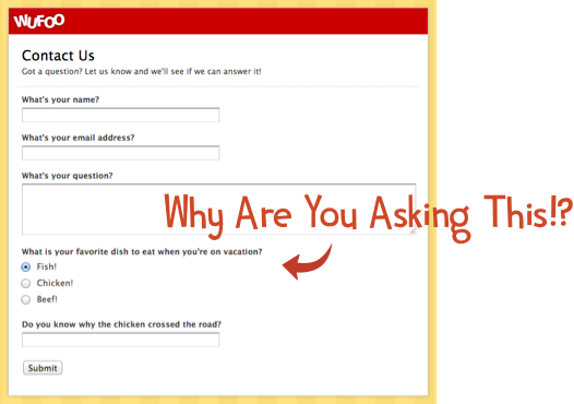
But then it starts to get out of control. You’re thinking, “Wait what about (insert information type here)?” You’re like, it can’t hurt to ask for it. It’ll be useful to have!

Then all of a sudden, you end up with a form that’s asking for a nickname (so you know, you can talk to them like you’re friends), whether or not they have a pet (since you need to know if they are a dog or cat person and tailor your pitch, right?), what color their car is (people with red cars are totally willing to pay more), or what their maternal grandmother’s maiden name was (hey, maybe you guys were related).
Don’t do it. Think long and hard about every single field you’re adding to your form and ask yourself, “Do I REALLY need this field?” If you don’t, remove it. Even if you’re 50/50 on whether or not you need, remove it. Too often we fall into the mind trap of thinking that this MIGHT be useful if we had it and then some how end up with a 19 field Contact Us form. That’s crazy.
Back to our freelancer example, why did we need a phone number? Are we ever going to contact a potential client by phone? If not—remove it. Removing fields has shown that people complete them far more often (to the tune of 120% better completion rate in one study!)
Only add fields for stuff that you DEFINITELY need. If you’re on the fence about something, remove it and see if you actually do need it later on. If you do, you can add it back in since you know you’ll need it. But I’ll bet you won’t even notice it was gone in the first place.
3. Ridiculously Long, Wordy, Meandering, and Confusing Field Labels
- “The name given to you at birth by your father and mother.”
- “The family name given to you at birth by your father and mother.”
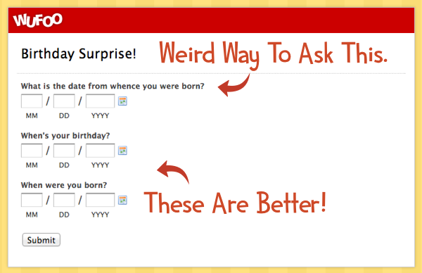
- “The date when you were born.”
“What place would you prefer to travel to if given the option and money were absolutely not a concern and if you’d never traveled there previously.”

These are horrible field labels. Seriously, don’t do these things. These are extreme examples (btw, one of those above is real) but the lesson here is simple: just be simple and direct. Instead of asking, “The date when you were born” ask, “When is your birthday”. Be concise, clear and people will find it easier to enter their information into your forms.
Much like #2 above, you need to take the time to give a long look at each of your field labels and make sure you’re being as straightforward as possible. Microcontent and editing is as important now as it was back in 1998 when Jakob Nielsen wrote about it. If you think it’s good enough, try again to see if you can remove more words while still retaining the essence of the message. The smallest of changes could make a world of difference in the number of people who start and complete your forms.
—–
If you follow (err, or, uh, NOT follow) these tips, I think you’ll find that your forms will be easier to digest, easier to understand, and easier to complete. More of your users and potential customers will find themselves at the finish line of your form, and you’ll collect more and even better data.
Stay tuned here for even more form Do’s and Don’ts to come. And don’t forget, if you’ve got some DON’Ts that people should avoid when making their forms, share them below!