Getting started is FREE! We offer different plan options depending on your needs, including an always-free plan. Check out our pricing page for more details.
Trusted by 3+ million users and some of the world's most popular brands.

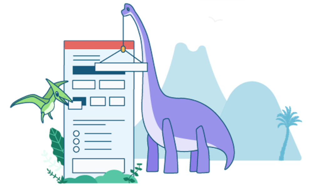
Build powerful online forms and customize them to your heart's delight.
Our form builder gives you an award-winning interface, easy customization, galleries, templates and reporting. Check out some of our popular features.