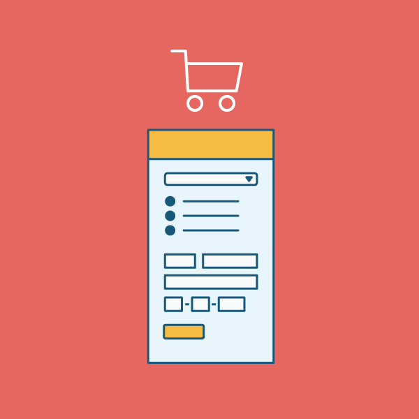
Let’s talk purchase order forms.
It’s a critical point of engagement between you and your customers that allows you to get paid and your customers to get what they need. Sure, an order form isn’t the most creative content your business puts out, but there’s no reason your customers can’t enjoy completing it. And if they do, the decision to complete it and make the purchase become all the more easy.
So how do you create a purchase order form that’s straightforward and fun to fill out? Follow these 7 steps to keep you on track:
1) Keep your purchase order form short. A longer form collects more customer data, but a shorter form offers a faster checkout…so which one should you choose? Luckily, the data is pretty clear on this. To maximize the number of purchases, go with the shorter form and the faster checkout.
People tend to spend about 10 minutes on an online survey. After about 8 minutes, people start losing interest or reconsidering their purchase. Overall, people are 20% less likely to complete a form if it has more than 15 questions, which means that a shorter purchase order form generates more orders.
2) Make every field essential. What do you absolutely need to know about a customer to fulfill an order? Collect that data (name, email, address, payment etc.) with your order form. Leave the rest (demographics, interests etc.) for a customer satisfaction survey, which you can send to customers after they’ve made a purchase.
Different Wufans need different data. We get that. The best fields to include in a florist’s order form are different from the best fields to include in a ski rental form. If you’re wondering which fields to include in yours, find a relevant online order form template from our template gallery and see what it asks.
3) Keep the language casual. People are often hesitant to make big commitments, including significant purchases or large donations. In your purchase order form, use casual language that puts people at ease and makes them feel comfortable with the order they’re about to make.
Say you’re running an online fundraiser for a local park. Instead of putting “DONATION FORM” in all caps at the top of your purchase order form, lead with a casual question like, “Can you spare $5?” or “Ready to make it real?”
4) Keep the content predictable. Customers should be able to predict details, like how much the order will cost them, before they reach the order form. People reconsider the value of your product or service when they’re confronted with surprise costs, like shipping or taxes, at the last minute. And it ultimately makes them less likely to follow through with a purchase: more than 50% of online shoppers who don’t complete an order list unexpected costs as their reason.
5)Use clean form design. Keep your form concise and simple to ensure that your form takers aren’t overwhelmed and know what’s being asked of them. Basic design elements, like the buttons you use, can help prospective customers navigate through your form, quickly. To review the different ways you can design your form, check out our theme designer.
6) Make your order form easy to find. If your form is accessible, people are more likely to make the purchase. Let your form be found at the right time and place by embedding it on relevant web pages, and by linking to it on emails to prospects who are further down the purchasing funnel.
7) Use the data you collect in your order form. Even short forms collect valuable data, like email addresses, from prospects and customers. If you have the data, why not use it? Engage these future customers as they complete your form by, for example, asking them to check a box to receive best practices-related emails from you.
Any small bit of effort to keep customers engaged and happy can help your businesses’ bottom line. For example, if you manage to improve your customer retention rate by 5%, it will increase your profits by at least 25%.
So follow these 7 steps to make your form accessible, simple, and enjoyable. Because once you do, there’s no stopping the orders from piling in. Start building your purchase order form today!

Comments
http://d5h45qvonz64ngvucx0hih66orzjnot6wtsqguotvnlj8fun3s.net d5h45qvonz64ngvucx0hih66orzjnot6wtsqguotvnlj8fun3s
BQLCrXN6WD3a
Posted October 12th, 2018 by Администратор всего.best dating site https://sck.pm/31H
Posted October 12th, 2018 by helen.Ti darò per te https://u.to/M_74FQ
Posted October 12th, 2018 by Carrie.