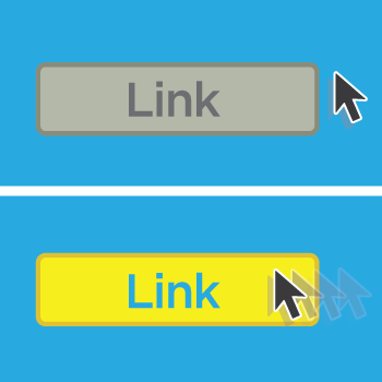
A few weeks ago, we started a brand new CSS series by teaching you how to create your own CSS stylesheet and add that to your Wufoo form. Today we’re going to stay simple and learn how to change parts of your form when you hover over them. This is done through a really easy selector:
:hover
The :hover selector is an absolutely simple and brilliant way to liven up your form. The most common use for the :hover selector is on hyperlinks. You know when you hover over a link and suddenly it’s a different color and underlined? That’s the :hover selector at work. We’re going to use the form and stylesheet from our previous post to show a couple of examples of the :hover selector at work. Let’s get started.
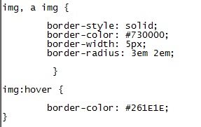
Remember the simple CSS we used last time to change the border color, width and radius through CSS? Let’s use that same image and change the border color when the user hovers over the image. Here’s what it’ll look like with the CSS from last time with it:

Where you see img:hover is where we change the border color. Now, if you hover over an image in your form the border color will change #261E1E. That’s black to you and me. Let’s check out a before and after shot:

As you can see when you hover over that image, it changes from burgundy to black. That’s about as sweet as the shark tattoo in the image! It’s a subtle, but great way to make your form interactive and a bit more fun to fill out. Ready for another example?
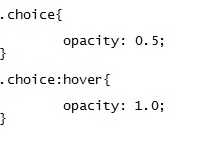
Let’s say you have a multiple choice field and you have images as your options in the field. You could make those images appear transparent at first and become more visible when you hover over the image. It’s also very simple to do. The class for the multiple choice selections is .choice. All you need to do is make those images transparent by default and then pull them into full view when one selection is picked. That can be done with opacity.

We want to make the images to be at least slightly visible at first so an opacity of 0.5 should suffice. We’ve then added :hover to that class to show the full image when the user hovers over the choice. How will the finished product look?
Want to see the form in action? Well, naturally. Check out our video snack below and stay tuned for more ways to improve your form through CSS!
Have more CSS questions? Leave them for Kane our CSS guru down below–we check daily!

Comments
Thanks for that. As a suggestion could we maybe have an advanced series running alongside this one? For instance I’d like to see a definitive wufoo CSS reset (in LESS for bonus points) and another cracker – which I have done myself but assume you might do better – is a wufoo > Bootstrap sheet. (Hey, if you take guest posts I could submit that code?)
Posted February 6th, 2015 by Tom Mayers.