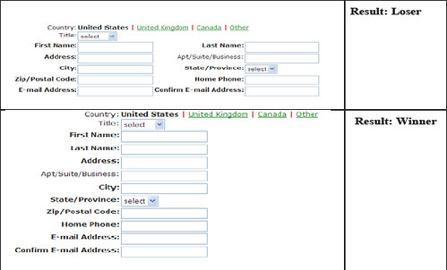
One feature request that we’ve received a few times is for the ability to add multiple columns to a form. You can currently float form fields alongside one another using a little bit of custom css, and we’ll discuss adding multiple columns into the form builder itself, but you might want to take a look at MarketingSherpa’s [Email Marketing Benchmark Guide 2007](http://www.marketingsherpa.com/exs/EMBG07_execsumm.pdf) preview before placing more than one field on a line. The entire report costs $247, but if you take a look at alert #2, you’ll see that the forms built with one field per line are the “winners”, while those with multiple columns are the “losers”.
As Kevin had said before in his [article on label placement](/2006/10/09/label-placement-above-is-faster-than-side/), “when it comes to filling out a form, you want your users to spend less time understanding your form and more time filling it out.” When fields are top down and predictable, the form often appears less complex and increases the probability that a user completes it.


Comments
Hmmm. I think that makes sense regarding multiple columns. But, I wonder if the requesters of this feature are really asking for the ability to have two associated fields on one line? Something like phone number and type sitting side by side for example.
Posted December 20th, 2006 by Graham.People also do ask for what you’re talking about, Graham. Interestingly enough, doing that doesn’t seem to increase usability either (http://wufoo.com/blog/2006/12/20/multiple-columns-does-it-hurt-or-help/).
Posted December 20th, 2006 by Chris Campbell.Everyone needs a hug.
Posted December 20th, 2006 by Nguyen Huu Huan.Good points about usability, no doubt. But on one form of mine, it really makes sense to have a field to the right of another one. I guess, think of it as a concept of a “grid” or axis associating 5 “colors” with 5 “products”. We are in the paint business. Visually (psychologically) speaking, having the 5 color input fields next to each of the 5 product dropdowns makes MUCH more sense. If I’m asking our sales reps to enter each color on each of 5 products, going down in this sense is much harder to make those associations that across.
Posted December 20th, 2006 by Mike Daffron.Everyone needs a hug.
Posted December 20th, 2006 by Hugger.