Prepare to get your happy dance on, because we’re releasing two exciting new widgets to kick up the awesome in your Wufoo reports: **Field Charts** and **Big Numbers**. Added to our [recently improved line up of graphs](http://www.wufoo.com/2008/09/16/report-upgrades-and-new-graphs/), these new widgets (in addition to some [cosmetic changes](http://www.flickr.com/photos/wufoo/3333029246/) we’ve made to the Report Builder) are some of the new goodness that’s come out of the second phase of our overhaul to Wufoo’s reporting engine.
###Field Charts
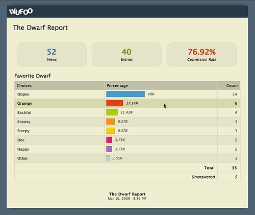
Field Charts are static tables designed to show at a glance the breakdown of the choices selected by certain fields. This layout is pretty popular for displaying survey data and will be familiar to our marketing veterans out there using Wufoo. In addition to the color-coded horizontal bar chart, they show the percentage and count for each choice, the total number of submissions that entered data for that field and the number of entries that left that field unanswered.
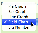
They’re extremely easy to set up. Just add a Field Chart from the Widget Type drop down, select the field you want to have displayed as a Field Chart and then BAM! You’re off to the races. Field Charts will show the 7 most popular choices for that field and then group the rest of the choices into an Other collection. This widget is available for the following fields: **Single Line Texts, Multiple Choices, Checkboxes and Dropdowns**.
###Big Numbers
The Big Number widget lets you pack a lot of punch into a small visual element. We’ve been using them for awhile now internally and we just adore their versatility. On the surface, it’s exactly what you’d expect: a big number. However, the options under the hood are super sweet and will help you add that extra emphasis to the metrics you find most important in your collected data.
For Big Number, you choose the type of data you want to display and the Big Number widget does the heavy lifting in regards to what’s possible for displaying that info. If you have **Multiple Choice Fields, Checkbox Fields or Dropdown Fields** in your form, you’ll be able to see the count for a specific choice. One great way to utilize this is to highlight the attendance from an invitation form.
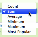
If you have **Number** and **Price** fields in your form, you have the following calculations available to process that data before displaying it in your report : count, sum, average, minimum, maximum and most popular, which would be **mode** for the math-inclined.
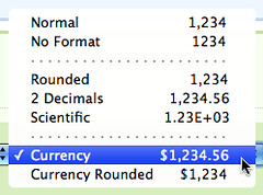
If you’re into the fancy, you can also setup your Big Number so that it shows the metric you’re tracking in different formats. In addition to adding comma separators on the thousands, we can round the number, limit it to 2 decimals, show it in scientific notation and display it as currency if you so desire.
We also included the ability to show data from statistics that we track on every form in Wufoo. Now you can show on your reports the **number of entries, the number of views, the conversion rate and the bounce rate** of the form right on your report. You can see this in action in the [Dwarf Report screenshot](http://www.flickr.com/photos/wufoo/3343859923/) we showed above.
For our users taking advantage of [Payment Integration](/docs/payment-settings/) in Wufoo, you’ll be happy to know that you can also use Big Number to track the payment info collected by your forms. Big Number + Payment Integration means you can do things like show the total revenue collected by your payment form, show what revenue was not paid by your users and even show the average revenue collected per entry. It’s cool beans for bean counters.
The Field Chart and Big Number widgets were, of course, also designed to look good in all situations and so are extremely Theme friendly. Like our graphs and likert fields, they will auto-magically adjust their backgrounds, border colors and typography colors to match your theme’s palette. No extra work needed on your end. It’ll just look good. For example, check out that same Dwarf Report from above in [Official Wufoo](http://www.flickr.com/photos/wufoo/3343859893/), [Down to Earth](http://www.flickr.com/photos/wufoo/3344694252/) and [Marie Antoinette](http://www.flickr.com/photos/wufoo/3344694298/).
These widgets are available to use right now in the Report Builder and are accessible to all users on all plans in Wufoo. We think they’ll open up your reports to a whole new world of showcasing your data and we can’t wait to see what you guys cook up. Now get out there get you some report lovin’!


Comments
Nice work. You guys are awesome!
Posted March 10th, 2009 by Galen.Now you can show on your reports the number of entries, the number of views, the conversion rate and the bounce rate of the form right on your report.
Yeah baby! Now if you could only add the referrering webpages to this report (to see vist sources), I could ‘see it all’! 😉
Posted March 10th, 2009 by John Rock.Love your work.
Posted March 10th, 2009 by LW.LOVE wufoo!!
Posted March 10th, 2009 by Sue.That is hot and works really well. Thank you for this welcomed additions!
Would it be possible to one day export this as a .pdf? Whenever I print, it loses the graphical goodness and I can’t share these reporting wonders with my colleagues!
Cheers
Posted March 10th, 2009 by Bosworth College.I heart you, wufoo.
Posted March 10th, 2009 by Amber.While I agree it would be really cool to export a report and all of it’s graphs, a .pdf report export isn’t on our current todo list. That said, we do still have some more enhancements in store for reporting.
Posted March 10th, 2009 by Chris Campbell.I used to have manually enter statistics into a giant workbook for out department’s annual report. Now I just use “The Big Number” and it does it all for me. You really can’t imagine how much time you’ve saved me by introducing this new feature. These Y-T-D numbers generated by the wufoo form have already been used to implement new policies in my department.
Bless you, wufoooooo!
Posted March 10th, 2009 by Robert Smith.Everyone needs a hug.
Posted March 10th, 2009 by Robert Smith.I’d love to see this on the form side of things too though. I’d like to create an order form that automatically calculates the order total for the customer before they submit the form.
Posted March 10th, 2009 by This Old Farm.The reporting is definately useful and improving. However one basic thing I don’t seem to see is a date sort/order option.
I have a ‘date submitted’ type colum and currently generate a line chart to show the number per date. However the dates are in order of the count rather than the date itself. This makes the graph almost useless.
Since this type of use is common in reporting, hopefully you have it on your to do list – hopefully near the top 🙂
Posted March 10th, 2009 by Duane.Everyone needs a hug.
Posted March 10th, 2009 by stas.Everyone needs a hug.
Posted March 10th, 2009 by RAKESH.