We’ve got a few payment related feature nuggets for you guys on this fine Monday morning.
###Payment Gets Its Own Page
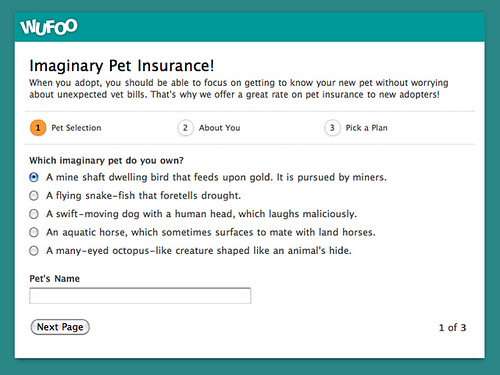
If you’re using our new [pagination features](http://www.wufoo.com/2009/11/17/create-sweet-multi-page-forms-with-wufoo/) to break up your form into multiple pages on one of our [payment enabled forms](http://www.wufoo.com/payments/), you probably noticed that our breadcrumb and page status features didn’t include the payment page as one of the pages in the paging navigation. In the screenshot below, even though there’s technically 4 pages the user will go through because of the payment page, there’s only 3 listed in the navigation.
This caused some expectation problems for some users filling out the form who didn’t realize that there was a final step in the process in regards to filling out the payment details (which is usually the most important!) on the payment summary page.
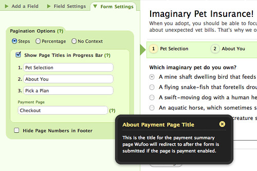
Because this wasn’t ideal for conversion rates and the user experience of your users, we made some changes in the [Form Builder](/docs/form-builder/) to provide a way to both incorporate that page and provide a custom label to the payment summary page if you have a payment enabled form with multiple pages.
This navigation also now shows on the payment summary page to make a seamless experience from beginning to end and help your users understand that the last step is right around the corner.
By default, this label is set to Checkout, but you can change it to whatever you want in the Form Builder. Just click on the paging navigation in the form preview to bring up these options.
###Limit Credit Card Types
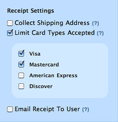
This one is for the users that use merchant accounts with our payment integration features that don’t accept all of the big four credit cards (VISA, MasterCard, American Express and Discover), we added a feature to allow you to only show the images of the credit cards you can accept through your merchant.
Just check off the credit cards that you want to show under the blue Payment Options section in the Payment Settings interface and you’ll see those options reflected on the Payment Summary page like so:
This feature is available for users setting up Payment Integration with PayPal Payments Pro, Authorize.net and USA ePay.
###Sandbox Mode
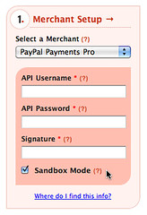
We know how important it is for developers to test things before letting features go live. For our users that want to test out their payments without having to pull out their credit cards and void charges over and over again while tweaking their forms, we’ve added the ability to set your forms to submit payments in **Sandbox Mode**.
Now, you can go all the way through the payment process on a Wufoo form and those transactions won’t actually charge your real credit card. This feature is also only available to users setting up Payment Integration with PayPal Payments Pro, Authorize.net and USA ePay.


Comments
Great! But as far as I can see this doesn’t work with 2 page forms i.e. page 1 collect info, page 2 payment. 🙁
Also how do I change the text “Base price” to something else (it’s “Standard charge” in the example above)?
Posted April 12th, 2010 by Ray.Ray, we don’t offer the pagination navigation on single page forms. And changing the base price text is not currently customizable. The charge in the example is because it was based on selecting a Multiple Choice field with a selection that was set to a certain amount.
Posted April 12th, 2010 by Kevin Hale.I can’t get this feature to work at all. I went back and remade the form and still nothing! UGH
Posted April 12th, 2010 by Corey Trhlik.Thanks Kevin. I’m sure there are reasonable technical reasons for it bit the payment page does feel a little disconnected from the rest of the form.
Posted April 12th, 2010 by Ray.Which feature, Corey?
Posted April 12th, 2010 by Ray.I also use single page forms and would like to see this feature become automatic. A single page form with payment is also a two-page form. Please do this soon.
Posted April 12th, 2010 by Fred Schlomka.Thanks
Fred
Great Job GUys
Posted April 12th, 2010 by cmac.It would be a great help for forms with multiple payment options to have a “total” field displayed somewhere and also, to be able to offer offline payment methods (like pay by check)
Posted April 12th, 2010 by Sandor.Sandor,
As it’s not possible to pay by check online (by definition), can’t this be covered using the standard fields?
Posted April 12th, 2010 by Ray.I have set my form up with two pages to collect data and the third should be checkout, but when I complete the form myself I sit get the “we are now redirecting you” page. Any ideas on how to fix this?
Posted April 12th, 2010 by Corey Trhlik.Corey, can you please email support@wufoo.com with a link to your form so we can take a look?
Posted April 12th, 2010 by Chris Campbell.Wow. This saves hundreds of hours of development per project. You rock.
Posted April 12th, 2010 by David Eisaiah Engel.I can’t get Sandbox to work either. I have Paypal Payment pro and a sandbox account created. When I reach the payment page on wufoo, I’m asked all the standard credit card info, but Paypal hasn’t given me enough to process the fake credit card. (i.e. No security code).
What am I missing?
Posted April 12th, 2010 by Jacques.Jacques, can you please send a ticket to support@wufoo.com with a link to your form so we can take a look?
Posted April 12th, 2010 by Chris Campbell.I found a work around changing the “base price” text.
Create a “checkbox” field.
Call it what you want to call it.
Check the checkbox so it is pre-selected when the user gets to the form.
But, under the “Add CSS Layout Keywords” write: hide. This will make the checkbox field invisible to the user.
Save the form
Then go to the “payments” tad and make sure that the “Enable Payments” checkbox is checked.
Set to $0 whatever “base price” you used to have.
Select the “Select a Price Enabled Field” checkbox that you created for your form and add the base price that you want the form to have.
Save the settings.
Test it
When you are done you will see that the “base price” have been changed by the new checkbox field that you created.
wufoo guys: Firstly, I LOVE you and your product. Secondly, make a video tutorial with these steps if you think it’s necessary.
This time…I deserve a hug. Hahaha!
Posted April 12th, 2010 by Jorge Morales.