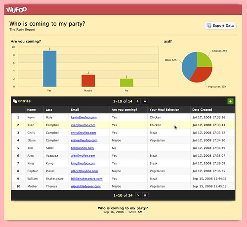
Our latest update to Wufoo is dedicated to our beloved report junkies–those of you trying to get a better handle on understanding and representing the data collected by your forms. Last week, we pushed up a number improvements and optimizations to the way reports are displayed.
###New Graphs
One thing you’ll probably notice is that we’ve replaced our graphing system with a shiny new one that’s got some sweet features that everyone should love. First of all, it’s very fast. On the old system, loading many graphs in a report resulted in pretty slow load and processing times and obviously that’s not an optimal experience. Thanks to optimizations we’ve made on the display engine, the new graphs load in a fraction of the time and without as much round-tripping to our servers. Good for us and great for you.
We were also able to implement a lot of nice details with the new graphing system.
– A cleaner look with a slightly better color palette.
– Tooltips that are more friendly and useful.
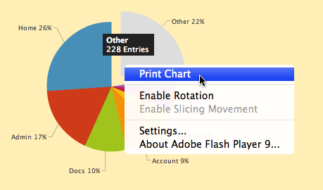
– Pie graphs now show the number of entries along with the percentage.
– Slices on a pie graph can be separated and highlighted with a click.
– Bar graphs are smarter. They’ll show more or less choices [based on the size of the graph](http://www.flickr.com/photos/wufoo/2847918725/).
– The “Other” column is a consistent color that stands out from the other choices.
For those of you looking for some print capability in reports, you’ll be happy to know that you can now at least print the individual graphs. Just right-click on the graph you want to print to find the option.
###Datagrid Tweaks
In addition to the new graphs, we implemented a few improvements in the datagrid that should make it friendlier and more flexible in a variety of situations. The rows are now zebra striped for better visual processing, the table headers won’t collapse into each other when you’ve selected a lot of columns to show, and we moved the green “Add Column” button out of the table header and into a container that surrounds the datagrid so that it’s in a fixed and more accessible space. This container around the datagrid was added to prevent the table from pushing and pulling your report layout out of shape. It’s very similar to what we did in the Entry Manager’s datagrid and we think you’ll like how smart it is, especially for users with large monitors.
###Better Theme Integration
And since we believe wholeheartedly that making you look good ultimately makes us look good, we made reports a lot smarter about how they incorporate your themes into the display. The reports can now incorporate drop shadows properly and the graph titles and labels will match the colors you’ve specified for your Section and Field titles. One of the nice little details we implemented in reports is in regards to the grid lines in the graphs.
Using a contrast formula we’ve developed, Wufoo automatically determines and uses the appropriate color for the grid lines based on your background color for your theme. This way, the graphs are easy to read and follow even on a dark theme palette. It’s a small detail that we think makes a lot of difference.
Well that’s it for that. The new architecture we’ve developed for these changes is a lot more flexible for us on the backend and so we’re excited about the possibilities that this new foundation opens up for Wufoo Reporting. Anyway, all of these changes are available to all users on all plans and we hope they make your day.


Comments
You guys are amazing.
Posted September 16th, 2008 by Chris.Sweet!
Posted September 16th, 2008 by Daniel Smith.Awesome. Thanks.
Seems the pie charts don’t like apostrophes, though. See http://mistersugar.wufoo.com/reports/scienceonline09/.
Posted September 16th, 2008 by Anton Zuiker.We’ve taken care of the problem with apostrophes and we should have a fix by the end of this week. Thanks for the heads up.
Posted September 16th, 2008 by Alex.I just love what you guys do and great creative writing. Mr. William Shakespeare would be proud.
Posted September 16th, 2008 by Kat Wilson.One more thing. I love the improvements, but could you please freeze both the row numbers and column headings in the report data grid? This would greatly help readability!
Thanks again for a great product and continual improvements!
Posted September 16th, 2008 by Daniel Smith.Guys, Just to say keep up the good work it is very much appreciated.
Posted September 16th, 2008 by Ian.I continue to be a thrilled customer of wufoo! wufoo has really helped make a BIG difference in connecting me with the Second Life Residents I want to hear from and respond to! My current form is right here: http://torley.com/contact.htm
wufoo support and notifications have been SUPERB! What a pleasant surprise to log in to my dashboard after some time of trouble-free activity, and hear about this upgrade.
One suggestion: I like the “Everyone needs a hug.” in this comments field, but it should automatically disappear when I click here. I had to manually erase it, and that’s a bit more choreful than it needs to be.
Posted September 16th, 2008 by Torley.Those are some pretty reports and graphs, indeed. After reading your color article over at particletree, I’m starting to appreciate the care you put into design. Thanks!
Do you have any plans to provide aggregate fields in the reports? I use a wufoo form for new memberships at sdspace.org, and it would be great to have a report of signups per month.
Posted September 16th, 2008 by Chris Radcliff.Chris, we do have a lot more going on with reports. I’m not sure which features will make the cut, but keep an eye out for future updates.
Posted September 16th, 2008 by Ryan Campbell.BIG HUGS!!!
Posted September 16th, 2008 by Leslie.Thank you thank you, I am jazzed to see the improvements, and now I look forward to not having to use screenshots just to print the graphs for my wufoo reports for my boss…
Yay!
I just wanted to say that I LOVE this site. I intergrated a super user-friendly form and linked to a tracking report for our site. I have received a lot of positive feedback on the layout and functionality of the form. Thank you wufoo for making my job so much easier! If you want to check out the form in action, visit our site – http://www.scarborosignsllc.com.
Thanks again!
Posted September 16th, 2008 by J A.