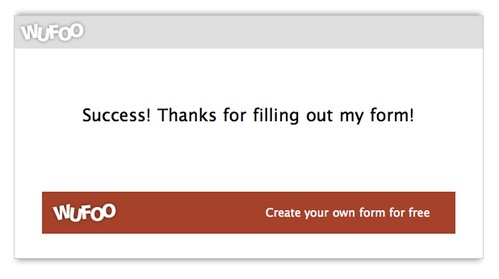
It’s a rare treat to be able to say that we’ve implemented a new feature that’s available only to our free users. Before this weekend, if you were a Gratis user, your confirmation page probably looked something like this:
Your theme didn’t carry over and a big blocky (kind-of-ugly) link advertising Wufoo showed up under your confirmation message. The reason we didn’t carry over the custom themes was to make sure the ads would always show up on the page (a necessary implementation for us since they help us subsidize these accounts). Of course, this implementation was always a real eye-sore to us and we’ve never been able to shake that feeling that there was a more elegant solution out there. Something more Wufoo-like.
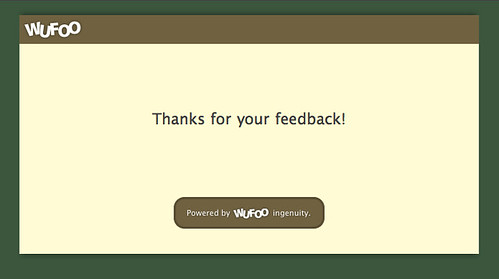
So we’re happy to announce that we’ve redesigned these ads to be smaller and to use our color contrast and matching formulas to better blend in with whatever theme you throw at them.
We think they’re a big improvement over the old and hope you’ll even enjoy sporting these sexier badges on your forms and reports. As always, if you’re on one of our paid plans, you won’t notice a thing since we don’t show these ads and links on paying accounts.


Comments
You win on the details.
Posted April 6th, 2009 by Jun.This is a great improvement! Thanks
Posted April 6th, 2009 by Matt.I’m a paid subscriber and would love to have a little more customization available for the confirmation text, especially with the size of the font, alignment, etc. Very minor request, but would be a helpful addition. Right now we don’t use it, simply because it looks a bit odd when it loads inside our website.
Posted April 6th, 2009 by Nathan.