For the last few months, we’ve been diligently working on completely transforming the report making experience in Wufoo. While we’ve always been proud of our ability to help you visualize your data, we always thought that we could do so much more.
Our vision for this new system was ambitious and so we’ve had to work on this project in stages. First, we started by rewriting the backend of the reporting engine so that it can take advantage of our new API system. This created a solid foundation for all the new stuff we wanted to incorporate and also had the nice side effect of making our export engine a lot more reliable. Earlier this year, we finished phase two, which launched a whole new set of widgets ([field charts and big numbers](http://www.wufoo.com/2009/03/10/new-report-widgets-field-charts-and-big-numbers/)) so you can show off your data in lots of new and exciting ways. The last step on this project, which we’re coming very close to releasing here, was to do a complete code and interface overhaul of Wufoo’s Report Builder.
While we’re still testing and putting the finishing touches on the new system, we thought it would be nice to take some time over the next few days to give a little preview here on the blog of the new interface and features. One of the biggest changes that you’ll see in the new interface is that it’s a lot more visual. Like Wufoo’s [Form Builder](https://help.wufoo.com/articles/en_US/kb/Form-Builder/) and [Theme Designer](https://help.wufoo.com/articles/en_US/kb/Theme-Designer/), the new Report Builder will be divided into two parts: a control interface that contains all the settings that you can manipulate in your report and a dynamic preview that’ll allow you to see what you’re designing. Today, we’re going to focus on the new control interface.
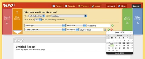
As you can see, we’ve decided to divide the report creation process in Wufoo into four steps with each step having it’s own specific settings. Navigating through the steps are easy. As you finish each step, just click on the next step’s title and it’ll slide out to show you it’s settings. We’ve worked really hard to make the feel of this interface very fast and very natural.
###Report Settings
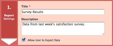
This is a fairly straightforward first step that’ll be familiar to everyone on the old system. This is where you’ll give your report a name and description. One new feature we’ve added here is the ability to allow or not allow your users the ability to export the data from the public report. This is good for allowing reports to show off your stuff without giving full access to your users.
###Data Settings
Just like in the old Report Builder, the Data Settings are where you specify what form you want the report to base all its data processing from. There’s been a lot of goodness added to this step. One feature we’ve added from the Entry Manager is to make filters context sensitive. For example, if you’re filtering by date, different conditions will show appropriate to that property (is before, is on, is after) in addition to a date picker. This smart processing makes filtering your data a good deal more intuitive and the options available to you a lot more accessible.
###Layout Settings
Again, very exciting stuff here. As you can see, reports in Wufoo will be able to take advantage of multiple premade layouts. This means you won’t have to stack all your widgets one right after each other. Instead you can use different zones to structure your widgets where you’d like.
Additionally, like in the Form Builder, we’ve got a dedicated section that’ll allow you to add your widgets where you want them by clicking or dragging them to the new Report Builder’s live preview. We’ve added all the same polish that you’ve come to expect from Form Building experience and we can’t wait for you to try it out.
That’s it for now. We hope you like what you see and we’ll be back with more soon.


Comments
Looks incredible. Nice job.
Posted June 16th, 2009 by Ryan Heath.