Wufans—did you know that 81% of Americans own a smartphone?
This shouldn’t come as a surprise. After all, in addition to connecting us to our bffs and fam, they let us do anything on the web, including taking forms!
In case your form takers are part of the mobile-savvy bunch, you should build forms that look nice and dandy on a smartphone. How, you ask? Just follow these best practices and you’ll be well on your way!
1. Keep it short and sweet
Think about it: How much time would you want to spend scrolling and typing out answers on a small screen? When you’re designing a mobile form, be considerate of your respondents’ comfort and time.
Here’s how:
- Limit the number of form fields for “Contact Forms“
- Use multiple choice questions for order forms and surveys
- Ask questions that are easily answered in a few words
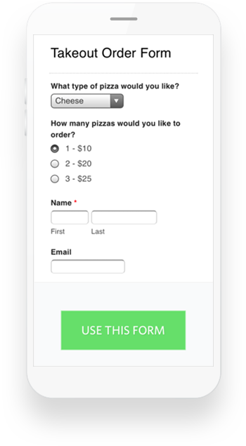
Here’s a good example of an order form with multiple choice questions. (And it’s double good because it features… pizza!)

- Choose your media wisely
Including images or video in your form? Be aware of bandwidth constraints which can delay image loading times and degrade image quality. Try to choose smaller images and avoid using too many on your mobile form. Also, if you are planning on using videos, it’s better to use a universal media player like YouTube to make sure everyone can access them. Follow this link to see how we embedded this video on a form to ask a very objective (and important) question.

- To customize or not to customize
CSS Keywords are awesome for quick form customization, but they can sometimes impact the form’s look on a smaller screen. Use them wisely for mobile forms. Here’s our help article on CSS Layout Keywords if you want to dive deeper into this topic, but here are a couple of basic recommendations:
- Avoid using CSS keywords that might squish the fields together on a smaller screen. You know that Wufoo lets you use CSS keywords to arrange form fields side-by-side, but that may not always work to your advantage on a mobile screen–so use them with that possibility in mind.
- If you want complete control over the look and feel of your forms, you can also link your own CSS file to a theme.
- Remember that at Wufoo we make our mobile forms automatically responsive, so you can trust our built-in design to give your customers a great user experience.
- Be thankful and strategic
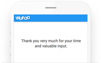
Keep your customers happy with a short ‘Thank you’ message once they hit ‘Submit.’ It serves both as a built-in confirmation message and a final touch point where you can make your customers feel extra special.

Another option is to set up a redirect that will help you make sure you don’t lose your customers on mobile: You can send them to a mobile-optimized page of your choice where, for example, they could sign up for your newsletter.
- Make sure it looks and works great on any device
Not all mobile devices are created equal. The same form in Safari on an iPhone might look slightly different than in Chrome on Android, and you never know what your customers’ device preferences are! Before you share your form, try filling it out on multiple mobile devices and operating systems. This way you can be sure that you will offer a great experience to people filling out your form. And remember the golden rule of mobile forms: keep it short, from your email subject line to your confirmation page.
We hope these great tips on designing mobile-optimized forms will give you plenty of information to consider and decisions to make. It’s all about reaching your customers where they are, and making sure that filling out your forms is as easy and quick for them as creating them was for you! Happy Form Building!


Comments
These tips are useful, by the way exactly by using your advices I was able to finish my working tasks, thanks for that.
Posted September 8th, 2017 by datemania.net.What can I do to ensure that banner images on forms are responsive? Right now they are not.
Posted September 8th, 2017 by Randall White.Great tips, we are working on the app right know should help us. Thanks
Posted September 8th, 2017 by yarkoweb.