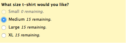
The Max Quantities feature is one of our more recent releases and we reckon it’s a bit fantastic. It’s a nifty little one that allows you to limit the number of times an option can be picked in a form. If a customer is filling out a field with this applied, they’ll see exactly how many times that option can be picked. It’ll look a little bit like this:

Not too shabby, eh? However, not everyone would be a fan of showing how many t-shirts they have left. It’s not possible to directly get rid of the text showing this, but being the superhero that it is, CSS is around to save the day. With CSS it’s possible to target that piece of text, shoot it with some laser eyes and send it fleeing from the form. Or to avoid the action scene metaphor, it’s possible to hide it. The CSS is mega simple as well. Check it out:

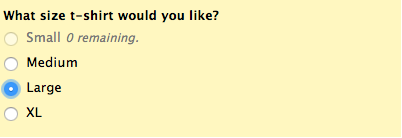
Not a massive amount to talk about with that. The colour of the text has just been made transparent, which will make it disappear from the form. When applied, it’ll look like this:

Looks like CSS has defeated the villain with one swift and beautiful move. All of those options still have the max quantities applied, but only small shirts, which have run out of stock will show the amount remaining. That way the user isn’t a bit confused when they can’t pick the small shirt they so desperately want. The same fate would be in store for the other shirts, if they were to run out of stock.
What’s that? You want the text for out of stock options to be gone as well and you need CSS to cancel its holiday to help you again? That’s chill. Just add a tiny bit more CSS. Check it out:
![]()
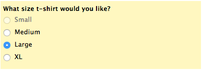
You will notice when the option has been disabled and will once again hide the text from the form. When applied, it’ll look like this:

Another job well done for CSS. Saving lives one character at a time!
Questions for Kane? You know where to go!

Comments
Oh man, I thought I was going to get a wufoo T-shirt! 🙁
Posted June 2nd, 2016 by Jeremiah.Everyone needs a hug. Will appreciate the it
Posted June 2nd, 2016 by Victor H Mudaala.I can’t get this “mega simple” CSS code to work on my form 🙁
I’m using individual “Time Ranges” to cover Stage bookings for an event (e.g. 3:00pm -> 3:20pm, 3:20pm -> 3:40pm etc). with Max Quantity = 1 for all Choices.
Applying the CSS code only hides all instances of the word “remaining”, but still shows “0” against all used “Time Ranges” and “1” against all unused “Time Ranges”.
If the .css is that simple, why not just implement it into the wufoo form builder, instead of making End Users play with CSS and upload .css files to a server or Dropbox??
Posted June 2nd, 2016 by Peter KORTGE.Is there a way to allow customers to order more than one t-shirt at a time? I love being able to set max quantities, but how do I allow a customer to log in and buy multiples of the same items and still allow max quantities?
Posted June 2nd, 2016 by Micah Goring.