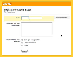
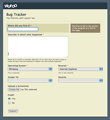
For our designers out there yearning for more layout flexibility in their forms, Team Wufoo is happy to announce two exciting features we’ve added to the Form Builder that should put a smile on your silly designer faces.
###Label Alignment###
Under the Form Settings tab, you’ll find a new drop down setting that will allow you to align your labels on top of your fields (Wufoo’s default) or to the left of them with left or right justified text. It’s a great way to save on vertical space and depending on how fast you want your users to process the fields (remember top aligned labels are the fastest), you can control the rate at which your users process those interface chunks. For more information about the ideas and rationale between the different label alignments in forms, check out Luke Wroblewski’s excellent article on [Web Application Form Design](http://www.lukew.com/resources/articles/web_forms.html).
This feature is made possible thanks to the results of some experiments we’ve conducted on Wufoo’s form markup and primary CSS for styling forms. This alignment change is actually being accomplished through a single classname change. That’s right, the markup stays exactly the same for all three label alignments, which is great for accessibility and our designers out there using Wufoo just for the XHTML/CSS markup. Man, isn’t CSS great?
###Advanced CSS Layout Options###
While this is a feature that’s been labeled “Advanced,” it’s really very easy to use and can be a potentially powerful tool in your Wufoo design arsenal. This field setting basically adds the classnames you specify to the parent element surrounding the label/field chunk you’ve selected. Obviously, classnames by themselves don’t do very much, but we’ve added some built in stylings into the Wufoo Form CSS that when called will provide some nice alternatives to the defaults we provide within Wufoo.
For example, if you wanted to have a field sit next to each other before we added this feature, it was a pretty complicated process that required a bit of CSS web design knowledge and usage of our advanced properties in the Theme Designer. Now, you can just add **”leftHalf”** and **”rightHalf”** to the appropriate fields that you want to sit next to each other and the Wufoo Form CSS will do all the rest.
Other useful classnames you can play with are **”hide”**, which makes that label and field hidden (useful for pre-populating information you already know about your users) and **”altInstruct”**, which makes the instructions for that field show beneath the field rather than as a pop up box on the side. We’ll be experimenting with and releasing more CSS alternatives as time goes on. Paired with the bring your own CSS feature in the Theme Designer, Advanced CSS Layout Options provides a lot of room to play for our web designers wanting more granular control over the look and feel of their Wufoo forms.
**Note:** This feature does NOT update live in the Form Builder. After you specify your classnames, just save the form and you’ll see the classes being applied to your live form and the form in the Entry Manager.


Comments
I absolutely love your application. I use it with my clients. Dare I say that it’s my favorite “web 2.0” application.
Posted November 15th, 2007 by Chris.I think your blog search function is broken… when I search on anything it returns me to the home page.
Posted November 15th, 2007 by Tom.When I specify rightHalf, it does not align it side by side, but rather one field is higher than the other. Any ideas?
Posted November 15th, 2007 by Jill.Make sure you add leftHalf to the field before it. They go in pairs. Also, when you enter it in the form builder, make sure there are no quotes around the word.
Posted November 15th, 2007 by Ryan Campbell.How about having a list a values go horizontal rather then vertical, like a 1 2 3 4 5 choice menu?
cool?
Posted November 15th, 2007 by Rob.Everyone needs a hug.
Posted November 15th, 2007 by Rob.^^ I 2nd that emotion, Rob. The one about the horizontal list like a 12345 choice menu. I need that right now.
Posted November 15th, 2007 by Joe.A comment to the one posted about the right and left alignment. I am having the same issue and am able to fix it by repositioning the order of the fields. The only problem i have is that takes away the functionality of the order most people would fill in the form. Example:
Posted November 15th, 2007 by nick.The first field displayed in the top left hand corner of my form is NAME. the one directly beside that is COMPANY. If i fill in the NAME and click the tab button it doesn’t take me to COMPANY it takes me to the message field. I hope i am clear on my issue. any help.