By Chris Coyier
When you embed a Wufoo form onto another web page, it will naturally stretch to the width of the container it is in. Imagine the purple area is the container you are pasting the Wufoo embed code into. The form will expand or contract as needed to fit:
Occasionally the circumstance will present itself where you need to embed a Wufoo form into a really narrow space. Here are some tips to ensure that your form looks its best.
In the Form Builder
-
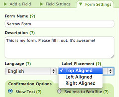
Top aligned labels – The default for Wufoo forms is to use top-aligned labels, so no need to change anything here. Trying to put your labels on the same line as your inputs (as happens with left or right aligned labels) takes up too much space.
-
No Fancy Pants Address – Our address field type is very large and uses fields set next to each other. This will be too tight for a form being tucked into a narrow place. If you need to collect address, use single line text fields stacked on top of each other.
-
No instructions – When you add “Instructions for User” for any field, the form will shrink in width to make an area on the right of the form in which to display these instructions. If you need instructions, try and include them in the form description or make the form labels descriptive enough to not need them.
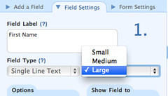
- And MOST IMPORTANTLY, Field Size: Large – This may seem counter-intuitive, but make all of your fields have “Large” as the setting for Field Size. Small or medium only use some percentage of the width of the container, but large uses 100%. In a narrow area, you’ll want to use that whole 100%.
Create a Narrow Theme
You may want to create a special theme just for your narrow forms. While not required, this will allow some design tweaks to make them look their best.
- Smaller fonts – In the Typography section of the Theme Builder, you can notch down the font sizes in use, which may make the form feel a bit more comfortable in the small space.
-
Custom CSS – There are a couple of tweaks that narrow forms can benefit from that you can only add via Custom CSS.
/* Hide blue WebKit outlines, which can be cut off weird */
input, textarea { outline: 0; }

/* Highlight visible all around field */
form li {
    padding-left: 4%;
    padding-right: 4%;
}
End Result
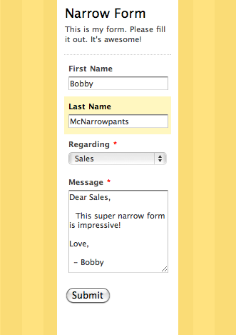
With all these tips at work, you can get a Wufoo form pretty darn narrow!


