By Kevin Hale
A few years ago, we released the ability to add CSS Keywords or classnames to your fields to create alternative layouts for your fields and forms. It’s been a great tool for designers who wanted to further tweak their forms’ layout and an easy way for users to take advantage of some of the more advanced CSS rules we’ve built into our Wufoo Form Stylesheet.
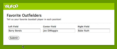
Today, we’re excited to announce a few more CSS Keywords you can use in your Wufoo forms. Three of them give you the ability to align three fields in a row like so:
leftThird middleThird rightThird
To align three fields side by side you can add these keywords to the CSS Layout Keyword option under Field Settings tab in the Form Builder. The three fields have to be right on top of each other in the Form Builder. The leftThird keyword has to be added to the first field, the middleThird keyword to the second field and the rightThird keyword to the third field like so:
These keywords work on all fields except Likert Fields. Please note that this feature does NOT update live in the Form Builder. After you specify your classnames, just save the form and you’ll see the classes being applied to your live form and the form in the Entry Manager.
Hiding Keywords
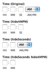
We’ve also added a lot of keywords to hide parts of the field you don’t need. These include hideSeconds, hideAMPM for the Time Field and hideSecondary to remove the Previous link on Page Breaks.
New CSS Keywords Documentation
You can find detailed instructions on how to use these CSS Keywords along with all the other keywords available to use on your forms in our brand new CSS Keyword Documentation! Filled with lots of screenshots and the most common use cases for the keywords, we think they’ll help you get the most out of your Wufoo forms!


